Three Winners at the International Society of Typographic Designers Student Assessment
The Department of Design and Creative Media is incredibly delighted to share that all of the entries from Atlantic Technological University (ATU) Donegal to this year’s International Society of Typographic Designers (ISTD) Student Assessment Scheme were successful.
Aine Kelly, Robert Egan, and Shannon Patton were all successful in their application to the annual ISTD Student Assessment Scheme. The ISTD assessment, now in its 47th year, offers students opportunities to engage with challenging design briefs that can integrate their learning and express their typographic practice. It requires students to undertake a rigorous investigation of a theme, develop a clear strategy, and produce a controlled and creative typographic design outcome.
As part of their prize, they have all gained professional membership to the International Society of Typographic Designers. The International Society of Typographic Designers (ISTD) is a professional body run by and for typographers, designers and educators. Across the world, their members are committed to raising the bar and inspiring a love for all forms of typography. The Student Assessment Scheme is unique for the value it places on a student’s entire project—not just the final outcome. The design process of research, reflection, strategy, design development, technical and production specification is all assessed by juries comprising practicing designers and educators. Their rigorous approach keeps standards consistently high, and ensures the scheme maintains its global significance. Students who are successful in the scheme are offered full membership of the ISTD.
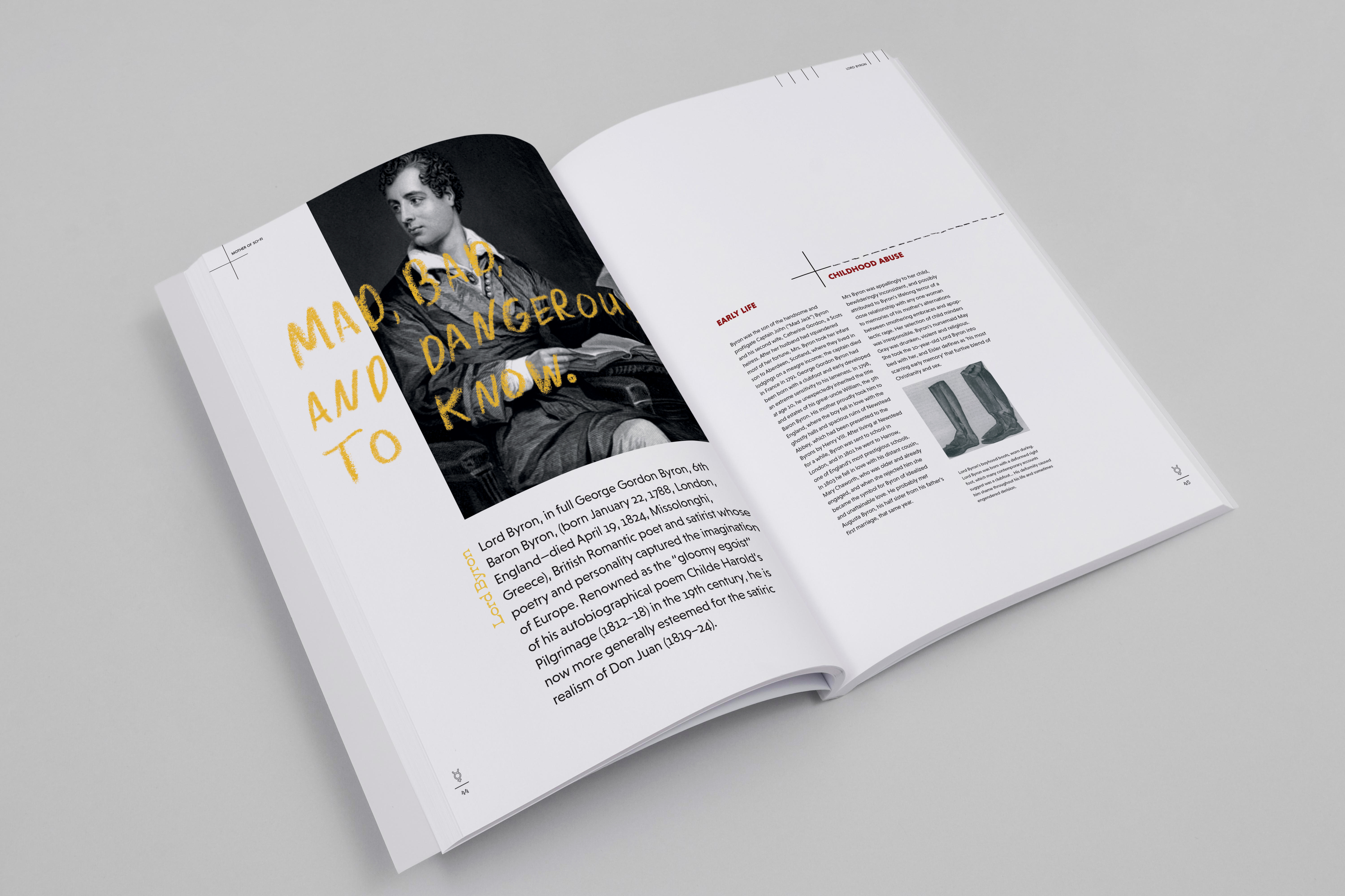
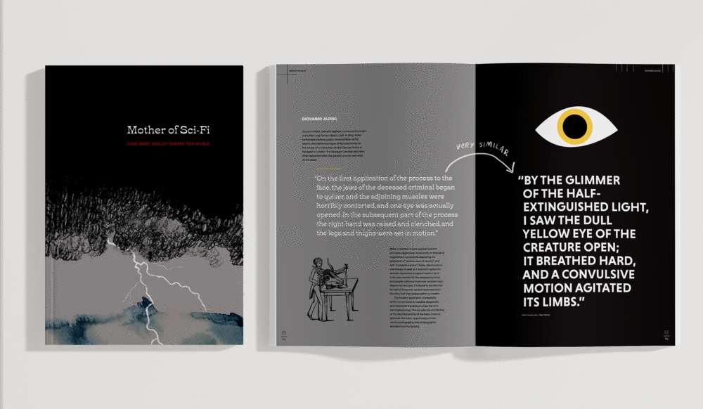
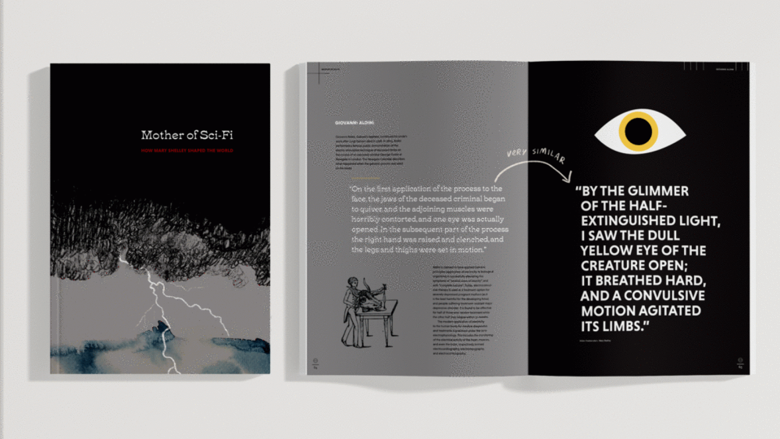
Frankenstein is an 1818 novel written by Mary Shelley, telling the story of Victor Frankenstein, a young scientist who succeeds in creating life. However, this is not the perfect specimen he imagines, but a monster, who is rejected by Victor and mankind. Mary Shelley’s publication, Frankenstein, resonated with me due to its themes of alienation, monstrosity, and dangerous knowledge. My objective was to delve into the symbolism within her writing, with an aim to uncover Mary Shelley’s life and what shaped this narrative. Upon reading Frankenstein, I noticed Shelley’s life was intertwined throughout the novel. Shelley’s influences and symbolism throughout the book stood out to me. I discovered that Shelley was the first female author to explore the dangers of playing with the unknown sciences of her era, making her the ‘Mother of Sci-fi’.
My aim is to celebrate this title by taking the reader on a journey into the mind of Mary Shelley. The target audience consists of Sci-Fi and gothic horror fans. Feminists would find this document interesting because Mary Shelley and her mother helped pave the future for women’s education and literature. People with interest in Frankenstein and Shelley’s life would find this document interesting and educational.
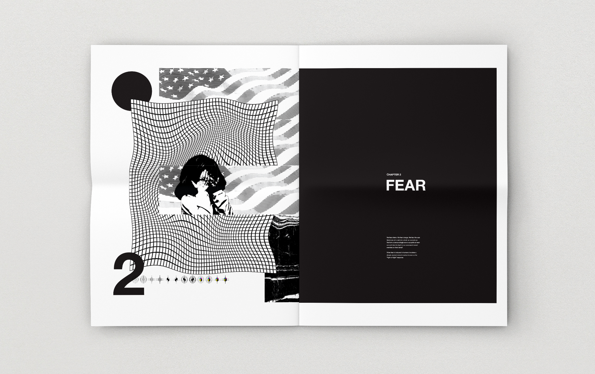
I chose to explore and interpret ‘A Colourful Story’ from the set of ISTD briefs. ‘The Colour of Fear’ is a critical analysis of how the colour of black is intertwined with modern America. The project aims to explore how media portrays an often negative outlook – stoking fear and anxiety in the reader. Fear is something that we can feel through the news, through political narratives or through the pressures of capitalist society – particularly in such a divided nation like America. The main themes discussed revolve around social issues, political unrest, racial and economic division and how media propagates a sense of fear in a culture many see as the focal point of the western world.
The front page depicts an abstract black shape designed to intrigue the viewer. When the page is turned, the black shape reveals some terrifying clippings taken from newspaper headlines – thus uncovering or revealing the extent of fear within modern news media. The 3 chapters contained within are Black, Fear and Consumerism, with each chapter featuring a news article or excerpt from a book discussing relevant views or information regarding topics of fear in U.S.A. I believe the eclectic collection of stories from various media outlets closely echo the real-life layout and narrative from newspapers. Imagery used often blocks out the person’s eye with a black rectangle – again this is a nod to the theme, whilst also adding a sense of fear to the subject.
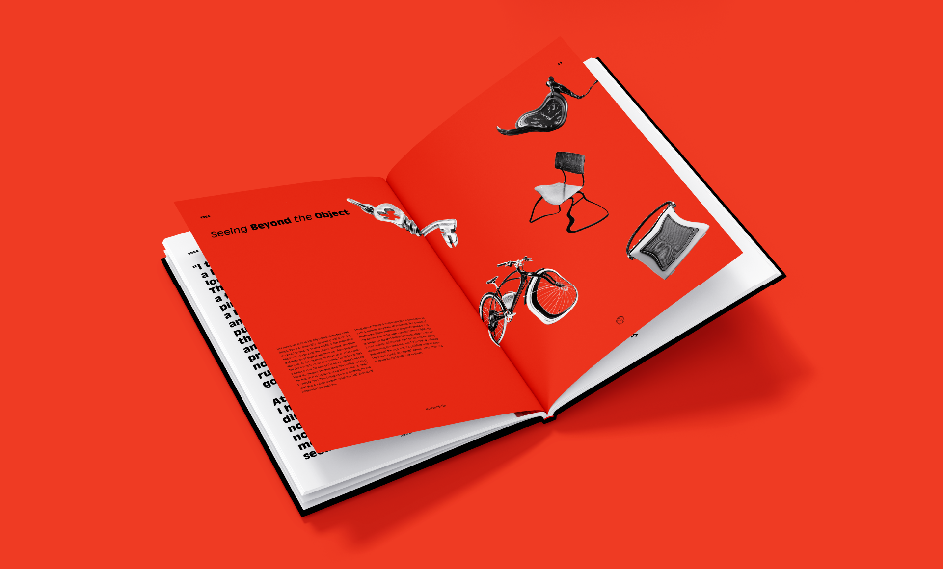
The goal of the book is to take the reader through the highs and lows of the original content and the reactions to it, much like the highs and lows of a mescaline trip. The acid tablets are inserted at the beginning with one missing - indicating this is the start of the reader’s journey or ‘trip’. The missing acid tab appears on a random page in one of the ‘high’ chapters in the book. The contents page is interpreted as the highs and lows of the trip, reflecting the themes within the content. My intention was to interpret the narrative and visualise the narrative and emotion and engage the audience on multiple levels to make a serious topic interesting to a younger audience who are the target audience. Sometimes I use it to represent being on the high of the trip on mescaline, experimenting and bending the rules when within the high chapters. On the low of the trip, these chapters were a lot more structured and serious.
In honour of Aldous Huxley’s book ‘Doors of Perception’, this book aims to change future generations perceptions of LSD and contribute to removing the taboo surrounding the use of psychedelics in some medical circumstances.